
The Art of Visual Communication: How I Engaged the Public During COVID-19
- By Heath Schreiweis
- Blog
As the world faced the COVID-19 pandemic, healthcare facilities played a critical role in managing the situation. In Cairns, a city in the northern part of Queensland, Australia, the local hospital became the epicentre of COVID-19 management in the region. As a designer working with the state government for the local Cairns hospital and surrounding facilities, I was responsible for branding elements of the pandemic, including news updates, fever testing clinics, vaccination clinics, and reactive restrictions and lockdowns.
The COVID-19 pandemic has been a unique situation that required a swift response from governments and healthcare facilities worldwide. In Cairns, the Cairns and Hinterland Hospital and Health Service (HHS) needed to create a cohesive branding strategy that would communicate the essential messages to the community in a clear and concise manner. As a member of the communications team, my role was to create branding elements that would support these messages.
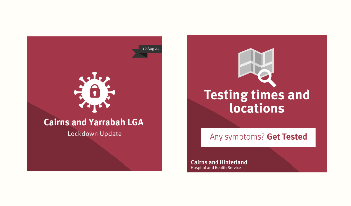
The first topic that required attention was the dissemination of news and updates related to the pandemic. Our team created a simple and brand representation logo for COVID-19 news updates. The logo was used on all communications related to the pandemic, including social media, email newsletters, and hospital posters. By creating a consistent visual identity, we were able to communicate important updates to the community in a clear and easy-to-understand manner.
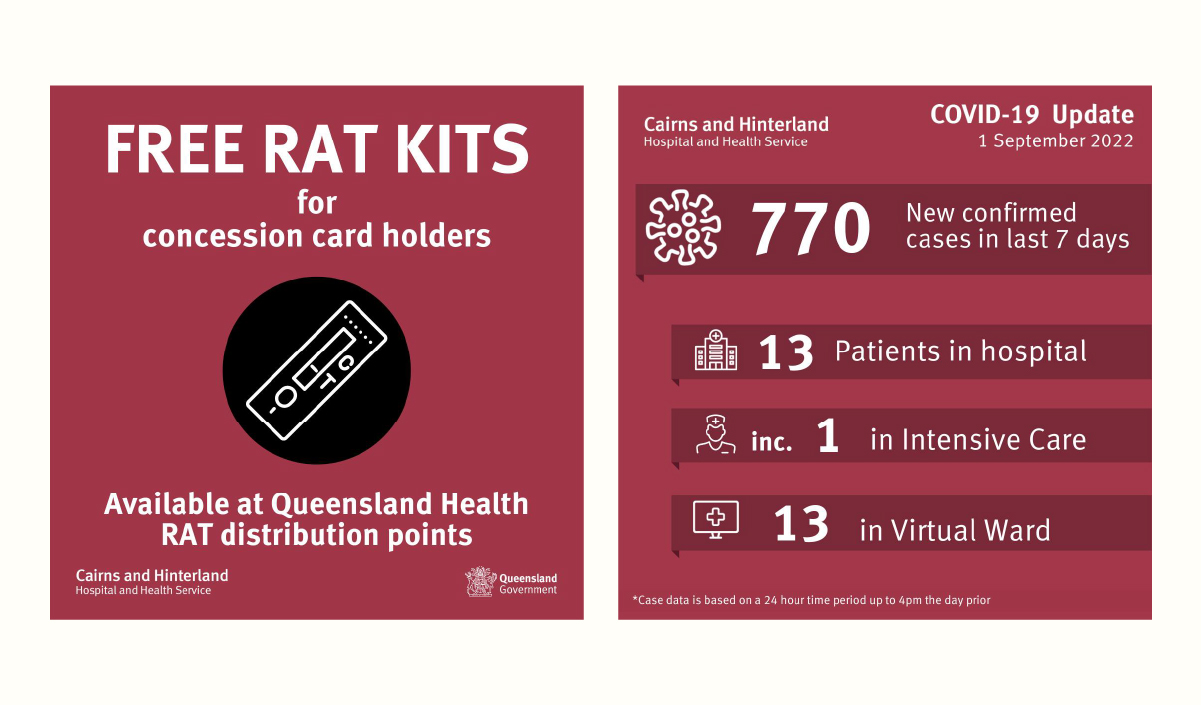
The second topic was branding and promoting the setup of local fever testing clinics. These clinics were crucial for identifying and containing potential outbreaks, so it was important to create a recognisable brand that would encourage people to get tested. We created a simple but memorable brand recognition and used it consistently on posters, banners, and social media graphics to promote the clinics.
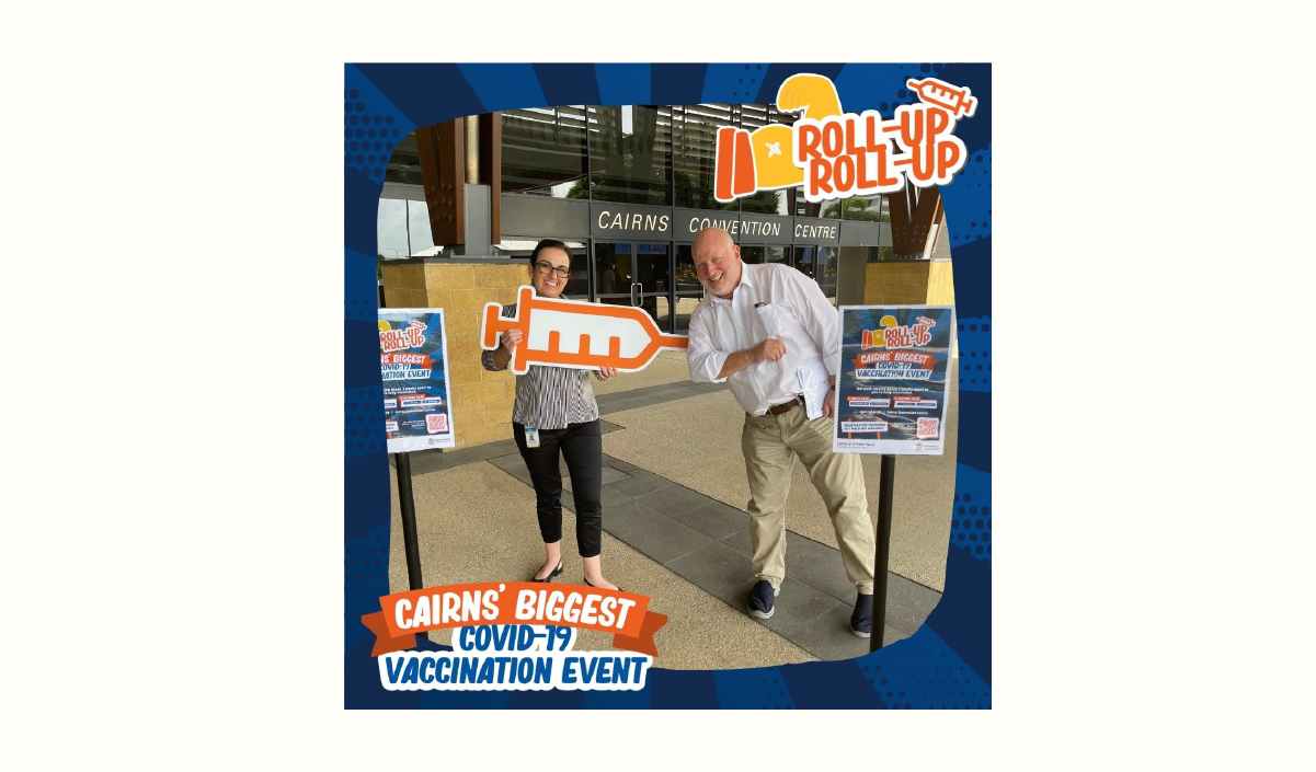
The third topic was branding and promoting the setup of local vaccination clinics. With the rollout of vaccines, it was important to create a positive and welcoming brand that would encourage people to get vaccinated. We used bright colours, friendly illustrations, and clear messaging to create a brand that conveyed safety and trustworthiness. This branding was used on posters, social media graphics, and even physical stickers that were placed on vaccination cards.
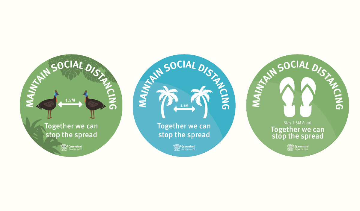
Finally, we were responsible for promoting any reactive restrictions and lockdowns. While these measures were not popular, they were necessary for controlling the spread of the virus. We created graphics that communicated the importance of following these guidelines, using bold typography and clear messaging to emphasise the severity of the situation.
The branding work was not only effective in communicating important information during the pandemic, but it also set a new standard for branding within the region and beyond. The success of the branding was recognised by other healthcare organisations within Queensland, and branding elements were copied and used statewide. This speaks to the quality and effectiveness of the work and highlights the importance of having a strong and consistent visual identity during times of crisis. By pioneering these branding elements, you have made a lasting impact on the way healthcare organisations approach branding and communications during pandemics and other crises.
Overall, creating branding and visual identity for the COVID-19 pandemic response was a challenging but rewarding experience. By creating consistent messaging and memorable branding, we were able to effectively communicate important information and encourage the public to take necessary measures to protect themselves and their community.