1.8M km² serviced by QLD Health 140K km² - CHHHS region 9 hospitals operated 250K people served
Background
Queensland Health and Its Districts
The Queensland Government’s Department of Health is a multibillion dollar organisation tasked with supplying public healthcare across a state of 1.8 million square kilometres and 5 million people. To manage this enormous area, it has been divided into regions called Hospital and Health Services - each one independently administered to meet the specific needs of the community it serves, from metropolitan cities to remote outback.
The Cairns and Hinterland Hospital and Health Service (CHHHS) covers an area slightly larger than England at 140,000 km², stretching from Daintree in the north to Tully in the south, and as far west as Corydon. With an annual operating budget of over a billion dollars, it runs nine hospitals - with Cairns Hospital as the largest - plus 20 additional healthcare facilities including community health services and mental health facilities. It serves approximately 250,000 people, around 5% of Queensland’s population, within a region that makes up 8% of the state’s land area.
The Project
Creating a Brand the Community Could Call Its Own
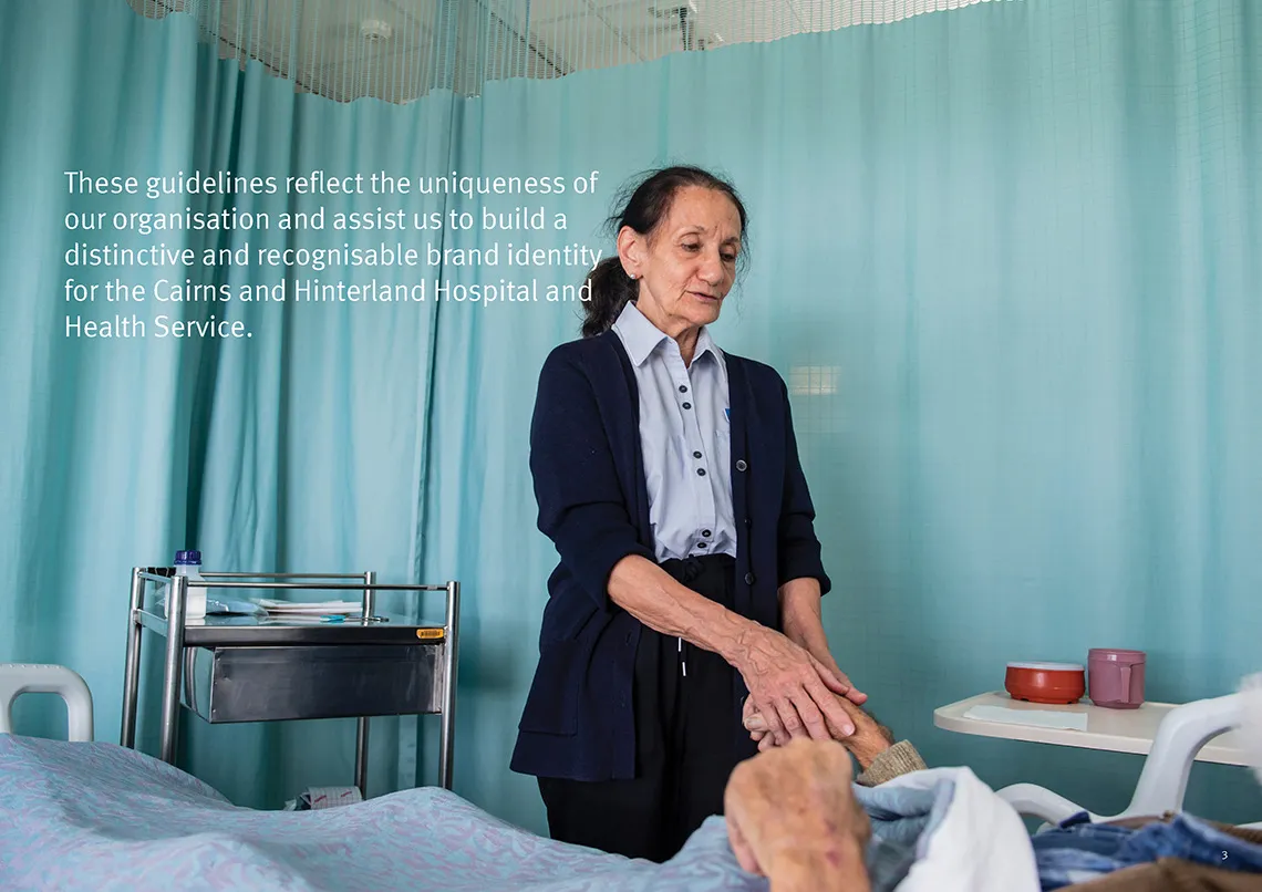
Like many Hospital and Health Services across Queensland, CHHHS saw an opportunity to develop a visual brand that genuinely reflected the region, its philosophy, and the values of the people it serves. With strategic planning and culture-building already well underway, creating a visual identity was the natural next step - something that both staff and the wider community could connect with.
“The task was to develop a brand that had engagement from staff and community, was relevant to the region, and used creativity to create a sense of belonging.”
Being financially responsible, the project was completed entirely in-house and at minimal cost - using internal design capability and leveraging the communications and media team to drive participation across staff and community.
The approach followed a straightforward three-phase process:
- Conduct a discovery survey to understand current perceptions and aspirations
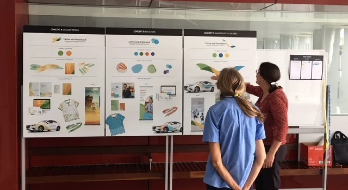
- Develop three distinct brand concepts based on the survey findings
- Run a community-wide engagement and voting process to select the final direction
Process
How We Got There
1
Brand Discovery - Taking the Temperature
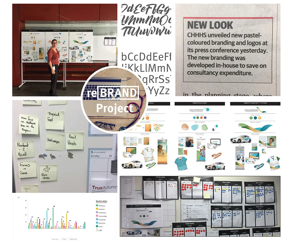
The process began with an online survey designed to understand how staff and community felt about the existing brand and what they believed a refreshed identity should represent. Participants were asked to select from a list of values-based keywords and rate the current brand on a series of scales.
Approximately 200 responses were received - a 3.3% engagement rate of health service staff - providing a solid directional foundation for the concept phase. 2
Brand Concepts - Ideas and Exploration
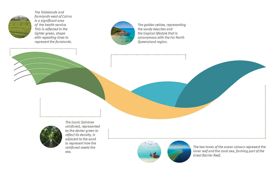
Survey results pointed to some clear themes. Participants associated the health service with being integral, friendly, reliable, comforting, and passionate. Colours were a strong point of connection, with an overwhelming preference for the blues, greens, and golds that represent the far north - and the tropical lifestyle it encourages. The rainforest and the reef stood out as the most prominent regional symbols, followed by farm life, waterfalls, and mountains.
Using colour theory and brand styling principles, three distinct concepts were developed that each incorporated these themes in a different way. Integral Friendly Reliable Comforting Passionate Bold Modern Professional Colourful 3
Brand Engagement - The Voice of the People
Once the three concepts were finalised, they were taken out to the wider community for feedback and a public vote. Engagement channels included:
- Online voting via the health service’s engagement portal, promoted through social media and community contacts
- A health service “road trip” visiting regional hospitals to discuss the concepts face-to-face with staff
- Presentations at key meetings including community consultative committees, clinical council, executive briefings, and hospital board briefings
Displays were also set up around Cairns Hospital to capture additional votes from staff and visitors.
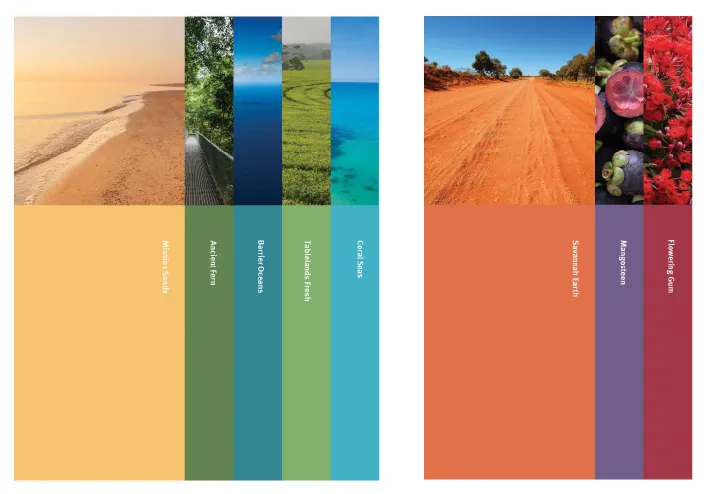
Colour
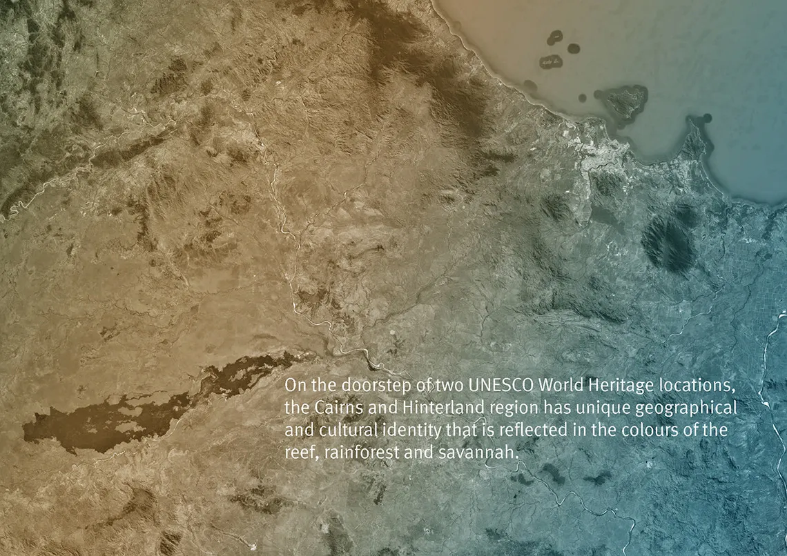
Our colour palette is derived from our unique environment and heritage. Our palette avoids the use of garish artificial colours. It is rich without being ostentatious and respectful to our audience and heritage.
Further refinement has been made to ensure the hierarchy of the colour palette is maintained allowing harmonised usage of colours. Corporate and supporting colours of the brand identity have been devised ensuring stronger identification and consistent usage.
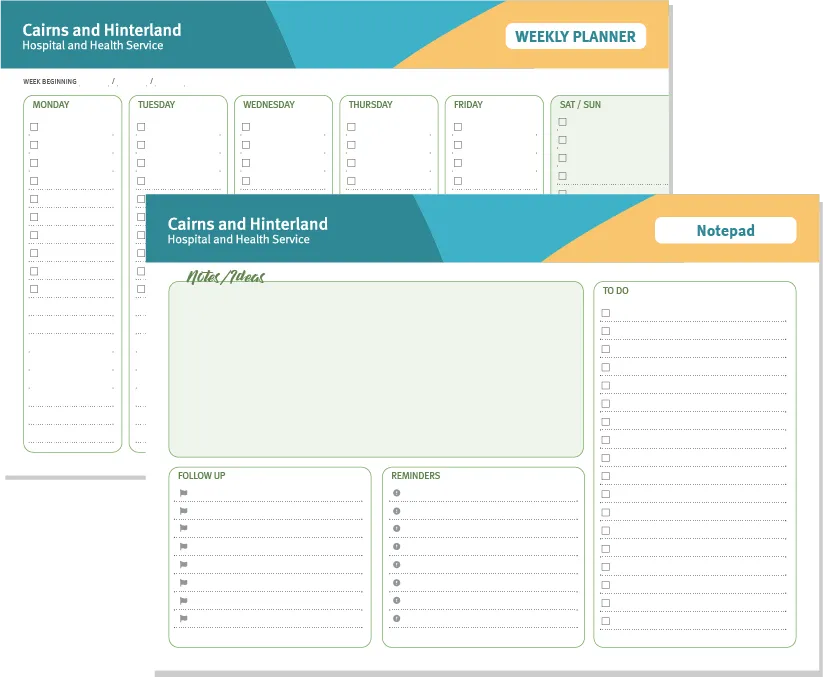
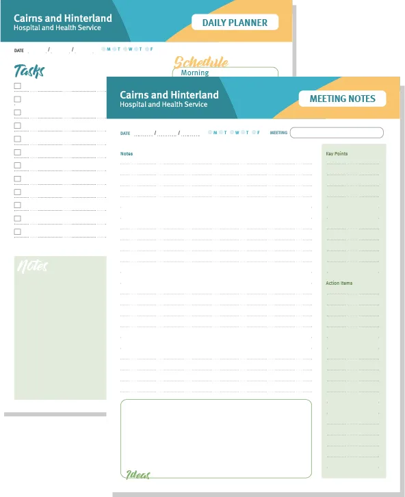
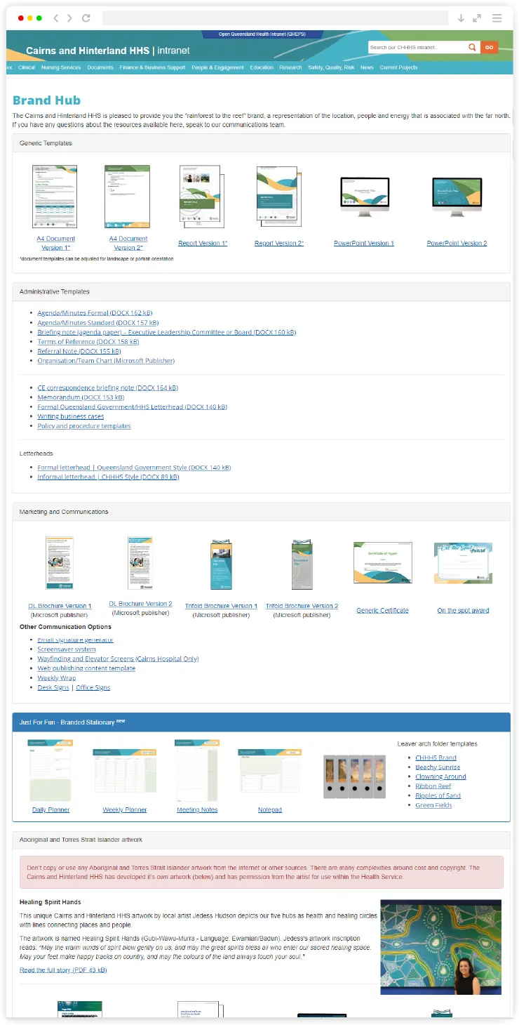
Custom printable stationery designed and available for staff to use in their day to day duties.
Internal ‘Brand Hub’ portal with templates, resources, stock images and illustrations that staff can access and use.
Results
What the Community Chose
1,141
total votes cast across all channels Concept C - Rainforest to the Reef Winner Leading by 98 votes over Concept A 37% Concept A - Golden Penda 33% Concept B - Boulders 30%
“The difference of just 98 votes between Concept A and C tells its own story - all three designs reflected the wishes of the community remarkably well.”
As of August 2018, the CHHHS rolled out the new brand progressively and responsibly - replacing existing resources only as they became outdated or expired, rather than a costly full refresh. The response from staff and community has been genuinely positive, with the brand becoming something people feel connected to and proud of.